
Tuesday, 28 April 2015
Tuesday, 21 April 2015


Final Product Work In Progress
Creating a Pencil Drawing & Inking
 Before starting anything I needed to illustrate my front cover.
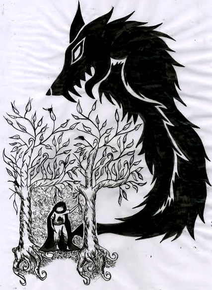
To start with I drew out the basic design on an A3 piece of paper. After spending a few hours perfecting this design I took a light box and then got another piece of paper before using use to trace of the design. This also took a few hours to perfect.
 This is the process of of inking which I did.
Once this had been completed I scanned the inked sheet into my laptop before moving it into a program called Paint Tools Sai and starting to colour it. Before anything I removed the white background of the sketch and then thresholded the lines so that instead of having grey lines I had black ones.
To start with I drew out the basic design on an A3 piece of paper. After spending a few hours perfecting this design I took a light box and then got another piece of paper before using use to trace of the design. This also took a few hours to perfect.
Once this had been completed I scanned the inked sheet into my laptop before moving it into a program called Paint Tools Sai and starting to colour it. Before anything I removed the white background of the sketch and then thresholded the lines so that instead of having grey lines I had black ones.
Colouring and Shading the Wolf (Front Cover)

Once the thresholding had been completed I started on making new layers and groups and then proceeding to colour the actual wolf. Due to my drawing style the original outline I'd inked was used as a guide line, so therefore the opacity of the layer it was on was lowered to about 20% before starting to add 'Fur' to the neck and face of the wolf. This was done by using a 'sketch' brush already installed on Paint Tools Sai and quickly making a base layer.
Under the base layer of fur would be an base colour layer which would be used to keep the hues I was going to use for the fur in the same range, so that i would only be using browns, blacks and whites.


This is what the image currently looked like with the basic fur shading an the nose completed, I also added whisker spots where a wolf normally has them.


Colouring and Shading the Wolf (Back Cover)


This is the final piece which will be used as the back cover of the book I am creating a cover for.
Creating the background

After i'd completely finished this process of colouring i started to create the background, I did this by copying my third experiment of melting crayons onto a canvas.

Instead of doing a multiple coloured canvas design like in my experiment, I decided to use red, orange and yellow hues to give a more menacing looking feel to the painting. I did this by holding the crayons over an A4 canvas and using a hair dryer to melt them into a splattered, demonic sky looking scene.


1st Cover Editing and Arranging in Photoshop


Once this was complete, I decided to add more text, this would be the price of the book when it was published and sold, the text upon the spine of the book and also the shelving category. so that there wasn't a massive variation in typeface, I decided to stay with only two choices of typeface.

I also then added the writers photograph, an small biography section on the flaps of the books according with the writer, a blurb, enhancement line, and also a bar-code at the bottom left-hand corner. Re-arranging these multiple time, I made it so that they were specifically placed to look profession and not amateurish.
2nd Cover Editing and Arranging in Photoshop

For my second final piece I took the already drawn wolf and instead of having it over the front cover only I put it over the front cover and also the back cover. This evidently made the detail on the cover a lot more noticeable. Due to the fact that it'd be over the spine of the book, i selected this specific bit and cropped the wolf out of it. This would be so that if you were to look at it on a book shelf you'd actually be able to read it.

After doing this I started to re-add the text I'd made on the previous version to this, but instead of having it in the same way, I decided to change it around. Enlarging the title and changing the position so that it wouldn't disrupt the canines head. Then adding the text on the spine, and also changing it so that back blurb text would also not disrupt the canines, it evidently made the book cover more spacey and profession

I then added the flap text and images, along with the book price. This would end up being my second final cover.
Thursday, 26 March 2015
Experiment 3
This is my third experiment and it is based on some images I found on Pinterest of melted crayons onto a canvas frame. This experiment linked to the little red riding hood theme by the poetic nature of the experiment. Throughout the project the main plan was to create a diverse, interesting book cover instead of a plain one. The ability to create an background using modern methods and then to change them digitally matched this idea instead of just creating on with pencils, or drawing it in Photoshop as a plain background. This experiment would also give me the ability to create a background with texture, instead of a flat 2D looking one.

These are some examples which I found firstly to base my work on and to also have something to aim my final product on.
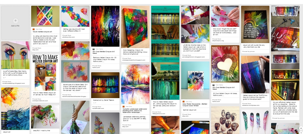
These are some examples which I found firstly to base my work on and to also have something to aim my final product on.

Firstly I brought a small canvas and then gathered together a small array of colours, before getting a hair dryer and starting to melt the crayons in different patterns on the canvas


These are work in progress shots of melting the different hued crayons to make an exploding type of effect.


This is the final product.
Final Draft
Here are my final two book cover designs to which I will choose from the both of them to create one final piece. Both are complicated but also extremely effect. Both covers feature the conventions of a good book cover, therefore due to this fact both work very well with the illustrated covers.


Wednesday, 25 March 2015
Friday, 13 March 2015
Emulation 2
The artist I'm going to make a copy of is Dave Mckean. I'm doing this so that I can experiment with the ways in which to make a figure / character be so creepy.

 I firstly drew out a basic outline and on a piece of paper, once this was completed I took another piece of paper, which was A3 and started to draw onto this piece of paper, over my original outline with ink.Once the whole inking process was complete I left the piece to dry before scanning it into my laptop.
 This was then put into Photoshop where I thresholded the illustration to make sure that it was definitely grey scale.
 This was the final piece.
This will be done digitally to get the best effect
. 
This is the piece of Dave Mckeans which I will be making an emulation of is this piece he's drawn. This is a piece which is for the story Coraline conveying her in a doorway and a creepy rat against a wall. Because of this I will also experiment and try to create a little red riding hood and wolf themed piece like this.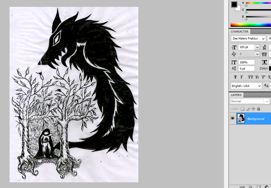
Subscribe to:
Posts (Atom)