Thursday, 26 March 2015

Experiment 3

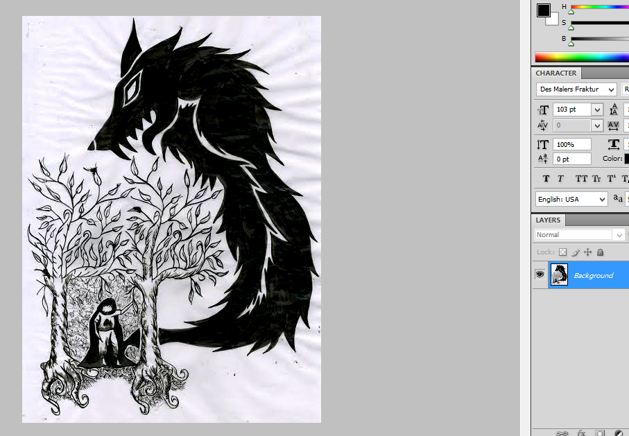
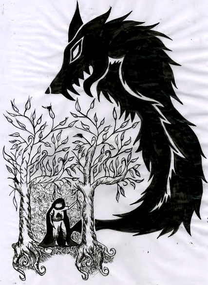
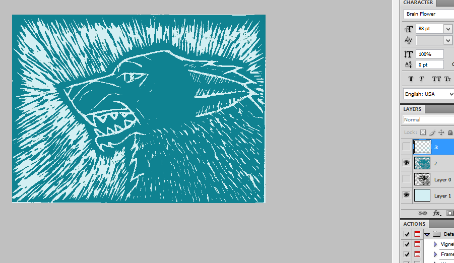
This is my third experiment and it is based on some images I found on Pinterest of melted crayons onto a canvas frame. This experiment linked to the little red riding hood theme by the poetic nature of the experiment. Throughout the project the main plan was to create a diverse, interesting book cover instead of a plain one. The ability to create an background using modern methods and then to change them digitally matched this idea instead of just creating on with pencils, or drawing it in Photoshop as a plain background. This experiment would also give me the ability to create a background with texture, instead of a flat 2D looking one.


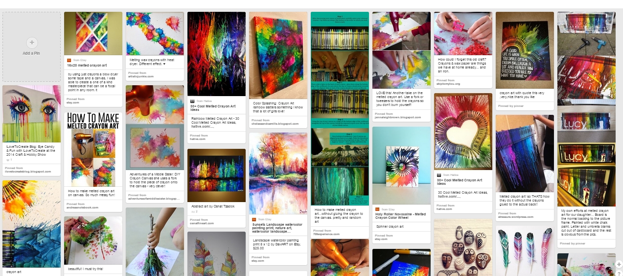
These are some examples which I found firstly to base my work on and to also have something to aim my final product on.

Firstly I brought a small canvas and then gathered together a small array of colours, before getting a hair dryer and starting to melt the crayons in different patterns on the canvas

These are work in progress shots of melting the different hued crayons to make an exploding type of effect.

This is the final product.

Final Draft

Here are my final two book cover designs to which I will choose from the both of them to create one final piece. Both are complicated but also extremely effect. Both covers feature the conventions of a good book cover, therefore due to this fact both work very well with the illustrated covers.


Friday, 13 March 2015

Emulation 2

The artist I'm going to make a copy of is Dave Mckean. I'm doing this so that I can experiment with the ways in which to make a figure / character be so creepy.
This will be done digitally to get the best effect

This is the piece of Dave Mckeans which I will be making an emulation of is this piece he's drawn. This is a piece which is for the story Coraline conveying her in a doorway and a creepy rat against a wall. Because of this I will also experiment and try to create a little red riding hood and wolf themed piece like this.


 I firstly drew out a basic outline and on a piece of paper, once this was completed I took another piece of paper, which was A3 and started to draw onto this piece of paper, over my original outline with ink.Once the whole inking process was complete I left the piece to dry before scanning it into my laptop.

This was then put into Photoshop where I thresholded the illustration to make sure that it was definitely grey scale.

This was the final piece.

Sunday, 8 March 2015

Colour Choices

I decided to explore and experiment with colour schemes before actually creating my final piece to get an idea of what type of colours I'd be using when creating my final. To do this I created four different colours drafts. Taking my previous draft and colouring it accordingly these were my results.

Analogous.


Complimentary.


Monochromatic.


Triadic.

Doing this helped me decided that I am more than likely going to create my final piece in desaturated colours to black and white colours whilst only containing one prismatic hue.

Thursday, 5 March 2015

My Own Type Choices

This is my typography moodboard. I created this using different types and images I collected off the internet. I specifically want the type I create to be legible for children and adults, and displaying a handwritten earthy feel to it. One example of hand written type would be the ' Top Secret Stamp ' tyepface which is located at the bottom left hand side on the moodboard above. Another example of this would be the ' Evenescent ' typeface displayed above in the middle to the left.
Like every book I was to create a legible type so that not only parents or guardians could understand it, but also younger generations would be able too as well. This legibility can be show in the 'Book Antiqua ' font shown at the top right. 

To create my type I got a pre-existing typeface from Dafont printed it out, and then blew it up to A3 size before getting some black and white paint and completely changing each letter and number. Above is the work in progress shots


This is my final product

Digital Type Choices

For this I gather a wide array of digital fonts and put them on a sheet before annotating them. This evaluation process would also aid me in my creation of my own type. I assessed the different elements in specific fonts and then worked through to see if they were effective or a bad choice for my children book cover

O Serif typeface
O Script
O Hand written feel
O Legible
O Detailed
O Display typeface
O Old looking type

O Serif typeface
O Script
O Hand written feel
O Not very legible
O Old looking type

O Slab Serif typeface
O Legible for titles
O Simplistic
O Sharp transitions
O Not very legible for body text

O Sans Serif typeface
O Hand written
O Legible
O Simplistic

O Modern typeface
O Display
O Digitally made feel
O Legible
O Simplistic
O No transitions
O Appropriate for titles
O Not appropriate for body text

O Display typeface
O Hand Written type
O Legible for titles
O Complex
O Small transition
O Not appropriate for body text

Drafting Ideas

 These are three further developed scamp's I created.
For each of these developments I added the typeface for the title and for the remaining text which will be on my book cover. I also added bar-codes, prices and flaps to the development of my book cover. This helped give a more professional feel, and from doing this I realized that my book cover looks more effect with a artists biography.

This is my first design. I remove the ripped cloak from my original scamp, and made it so the whole wolf head was visible. It also gave a much better effect so that the book title was more legible. On the back cover I added an enhancement line and book category.

This is my second draft and with this design I also added a book category to the back of the book. Although  I did change the position of the " Charles Perrault " on the front cover to be closer to the title.

This is my third development draft, and with this i changed the back cover so that it no longer had any tree but only a sky line view, with a moon and what would be turned into clouds. I also changed the Charles Perrault photo and biography.

Emulation

For my emulation I copied the technique and design previously created on my lino copy.

I decided to do a emulation of a canine / wolf design so that it would match the little red riding hood theme. This would help me determine if I would use the lino technique for my final piece, and if it would be easy enough to show fur on the wolf. I started to draw out in pencil on the piece of lino the wolf design I was going to try and cut out.

I spent about 8 hours cutting out the pieces and trying to make it look like the wolf possessed fur, this was harder than I originally though and took longer than I expected previously.

Once all the pieces were cut out I then rolled out the ink, covered my piece of lino in ink and then pressed it down onto a A4 sized piece of white paper. following the same steps I did in my copy I then rolled onto the piece of paper to transfer the ink onto the paper before pulling it off and setting it to dry.

Scanning in the dry pieces of paper after 24 hours, I put the photos into photoshop and changed they levels so that it would emphasise the black and white background and foreground. This was then changed to various different colours which I could overlay on top of each other.

This was my final design.

Monday, 2 March 2015

Artist Copy

First I found an artist which I would like to copy, after looking on Pinterest for different ideas I found some piece of work which had been completed with lino. This process is done where by the cut out chunks of lino, roll ink over them and then print them onto another piece of paper.

Secondly I found a lino pattern someone had already created and then selected a section of this image decided upon how big the sheet of lino I would copy it on. Next I printed out the section of lino art already created and started to draw onto my piece of lino a copy of the pattern, this was done the closest I could get it.

Next I started to cut out the white sections of lino. This in total took about ten hours over two nights to complete it.


After completely cutting out the chunks of lino I needed to, I took a roller and rolled ink onto the piece of lino so that the raised parts would get covered in Ink. After doing this the inked piece of lino was then pressed down onto a piece of A4 white paper and rolled multiple times with another larger roller so that the ink would transfer from the lino to the piece of paper. Although the print was then backwards this wouldn't matter because it would be left to dry to then put into photoshop.

Once it was scanned in and put in photoshop it was thresholded and then the colour was changed to make it more attractive and appealing. Because I'd purposely made some copies lighter than others it gave me the chance to overlay one copy onto the other, therefore I could use two colours.

This was the final product