
For this I gather a wide array of digital fonts and put them on a sheet before annotating them. This evaluation process would also aid me in my creation of my own type. I assessed the different elements in specific fonts and then worked through to see if they were effective or a bad choice for my children book cover
 O Serif typeface
O Display typeface
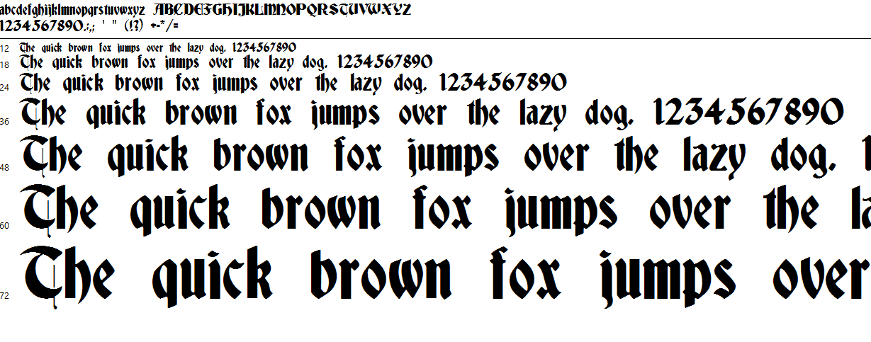
O Old looking type


O No transitions

O Small transition
O Not appropriate for body text
O Script
O Hand written feel
O Legible
O DetailedO Display typeface
O Old looking type
O Serif typeface
O Script
O Hand written feel
O Not very legible
O Old looking type
O Slab Serif typeface
O Legible for titles
O Simplistic
O Sharp transitions
O Not very legible for body text
O Sans Serif typeface
O Hand written
O Legible
O Simplistic
O Modern typeface
O Display
O Digitally made feel
O Legible
O SimplisticO No transitions
O Appropriate for titles
O Not appropriate for body text
O Display typeface
O Hand Written type
O Legible for titles
O ComplexO Small transition
O Not appropriate for body text
No comments:
Post a Comment